Uber 2017-2018 service-animal denial reports
- Table of reports by month
- Visual and audio line graph of reports by month
- Visual and Approximate Audio Line Graphs of Percentage of Total Trips Resulting in a Service-Animal Denial Complaint
Table of Reports by Month
The following table lists the number of complaints of ride denials by month because of service animals as collected by Uber and reported to the NFB (note that February 16, 2017 was the first date for which Uber reported receiving service-animal-related service denial complaints in its data reports to the NFB):
| Month | Number of Denial Reports |
|---|---|
| Feb 16-28, 2017 | 196 |
| Mar 2017 | 628 |
| Apr 2017 | 457 |
| May 2017 | 637 |
| Jun 2017 | 545 |
| Jul 2017 | 502 |
| Aug 2017 | 399 |
| Sep 2017 | 490 |
| Oct 2017 | 509 |
| Nov 2017 | 561 |
| Dec 2017 | 505 |
| Jan 2018 | 408 |
| Feb 2018 | 452 |
| Mar 2018 | 461 |
| Apr 2018 | 464 |
| May 2018 | 543 |
| Jun 2018 | 485 |
| Jul 2018 | 489 |
| Aug 2018 | 523 |
| Sep 2018 | 518 |
| Oct 2018 | 496 |
| Nov 2018 | 480 |
| Dec 2018 | 547 |
Visual and Audio Line Graph of Reports by Month
The following visual and audio line graph shows the number of complaints of ride denials by month because of service animals as collected by Uber and reported to the NFB (note that February 16, 2017 was the first date for which Uber reported receiving service-animal-related service denial complaints in its data reports to the NFB):
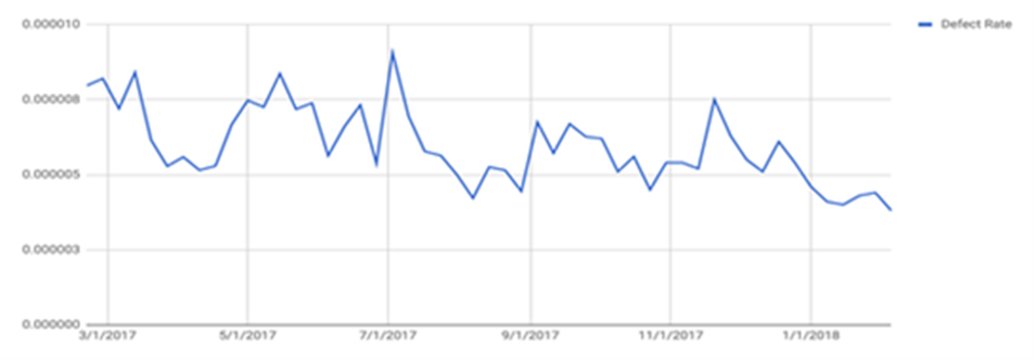
Visual and Approximate Audio Line Graphs of Percentage of Total Trips Resulting in a Service-Animal Denial Complaint
Uber produced the below chart, which shows the percentage of total trips that result in a service animal denial complaint. (The audio version is an approximation of Uber’s visual chart because the underlying data was not made available.)
The chart is a line graph drawn to connect specific data points, though the actual points are not specifically provided. It looks spiky rather than curved or smooth. The line is labeled as “defect rate.” The x-axis has six labels: 3/1/2017, 5/1/2017, 7/1/2017, 9/1/2017, 11/1/2017, and 1/1/2018, though the line starts and ends before and after the first and last labels on the graph. The y-axis has five labels: 0.000000, 0.000003, 0.000005, 0.000008, and 0.000010. No plotted point ever reaches up as high as 0.000010 nor down a low as 0.000003. The lowest plotted point is approximately 0.000004, reached sometime after 1/1/2018. The highest plotted point appears to be somewhat above 0.000008, reached around 7/1/2017. Other than a clear downward trend starting just around 1/1/2018, the rest of the graph varies between 0.000005 and 0.000008, with spikes above that shortly after 5/1/2017 and 7/1/2017, and dips below around 8/1/2017, 9/1/2017, 11/1/2017, and after 1/1/2018.